Displaying Results
After running your simulation in Qucs-S, a Dataset is generated. This contains the raw output data from the simulation. See Understanding File Structure for more information.
To display your simulation Dataset in a human-readable form, use the Diagrams feature. Diagrams are graphs/plots/tables that you can place on your schematic page. An example is shown in the figure below.

An amplifier being simulated in Qucs-S, with Cartesian Diagrams to display its performance, in both the time domain and the frequency domain.
Available Diagrams
Qucs-S supports the following diagrams, regardless of which backend you choose:
Basic Diagrams
Cartesian Graph (2D)
Polar Graph
3D Cartesian Graph
Tabular: A simple table. Particularly useful for DC simulations.
Smith Charts
Smith Chart
Admittance Smith Chart
Polar-Smith Combination Chart
Smith-Polar Combination Chart
Specialty Diagrams
Locus Curve
Digital-Focused Diagrams
See the introduction to Digital Simulation.
Timing Diagram
Truth Table
Creating Diagrams
In this example, we’ll be using the simple RC circuit shown below to demonstrate the Diagrams feature.
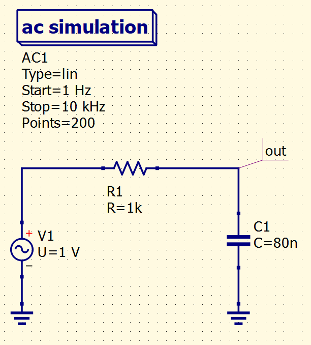
Simple RC filter circuit, which will serve as an example of how to use Diagrams.
Warning
You MUST run a simulation at least once before attempting to create a Diagram. If you don’t do this, no data/variables will be available for you to select (because without running at least one simulation, there is no Dataset to graph). Qucs-S will not allow you to place a Diagram without having a Dataset for it to depict.
Placing on the Page
To show this filter’s frequency response, we can graph \(V_{out}\) on a normal 2-dimensional Cartesian plot.
Tip
In reality, it’s more common to graph a ratio to show frequency response, perhaps \(\frac{V_{out}}{V_{in}}\). It’s also very common to convert the ratio to dB.
This is all achievable within Qucs-S, you just need to use the Equations feature. However, for this example, we will simply graph \(V_{out}\), to keep things simple.
To do this, we can use a Cartesian Diagram. This is available in the Diagrams section of the Components tab. To place one on your schematic page, single-click on the diagram in the Components tab, then click somewhere on your schematic page to place it there.
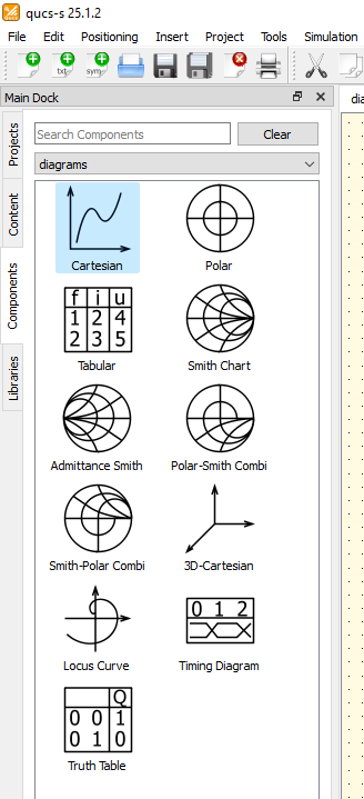
The Diagrams section of the Components tab, with the Cartesian Diagram selected.
After placing it on your schematic page, you’ll be greeted with the Properties dialog for your diagram. This dialog is shown below, with annotations on how to navigate it.
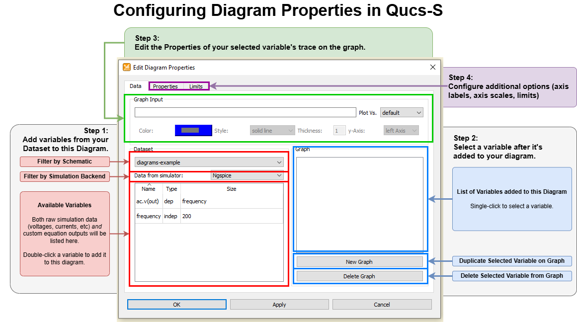
An example of the Properties dialog for a Cartesian Diagram in Qucs-S, with annotations explaining how to configure it. Most of these options will be similar across other diagram types.
You’ll need to choose at least one variable to graph on the Diagram. In this case, we’ll graph the voltage at the node labeled out. We can do this by double-clicking ac.v(out) in the “Dataset” section of the dialog.
With the ngspice backend in the example above, variables are in the form simtype.datatype(netname), where simtype is the simulation type (AC, transient, etc), datatype is the electrical data type (voltage, current, etc), and netname is the label applied to the circuit node.
Tip
Variables may appear with a different naming convention when using other simulation backends, but navigating the Properties dialog is the same.
After adding the ac.v(out) variable to this graph, the Properties dialog looks like this:
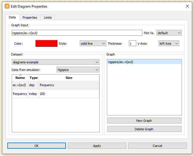
The Properties dialog for the example Cartesian Diagram, after adding the ac.v(out) variable to the Diagram.
At this point, we can click “OK” to exit the Properties dialog, and the graph will appear on the schematic page as shown below.
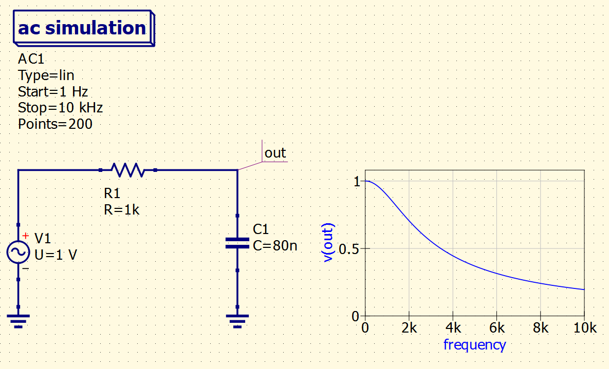
The example RC filter circuit, with a Cartesian Diagram succesfully placed on the page, graphing the frequency response of the voltage at the out node.
Customizing Diagrams
A number of additional customizations can be made to the Diagrams, from within the Properties dialog. Available customizations may vary across the Diagram types. The most common customizations are described in the sections below.
Setting Trace Thickness/Color/Style
Each trace on a graph can be set to any arbitrary color, thickness, or line style (solid, dashed, dotted, circles, stars, and more). This is all adjusted within the Data tab of the Properties dialog. First, select the trace you wish to adjust under the “Graph” section at the bottom right, then its settings will appear in the “Graph Input” section (top center of the window).
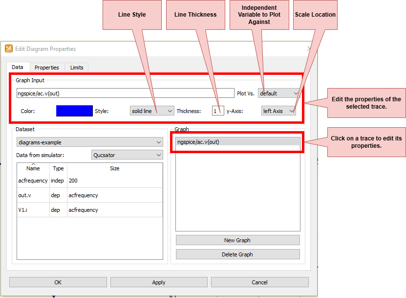
Editing properties of a trace on a Cartesian Diagram.
Color can be set by clicking the “Color” rectangle in the “Graph Input” section. This opens an additional window (shown to the right of the main Properties window in the figure below). The color can be selected manually, from common presets, or specified numerically using hexadecimal, RGB, or HSV format. It can also be chosen with an eyedropper-style tool by clicking “Pick Screen Color”.
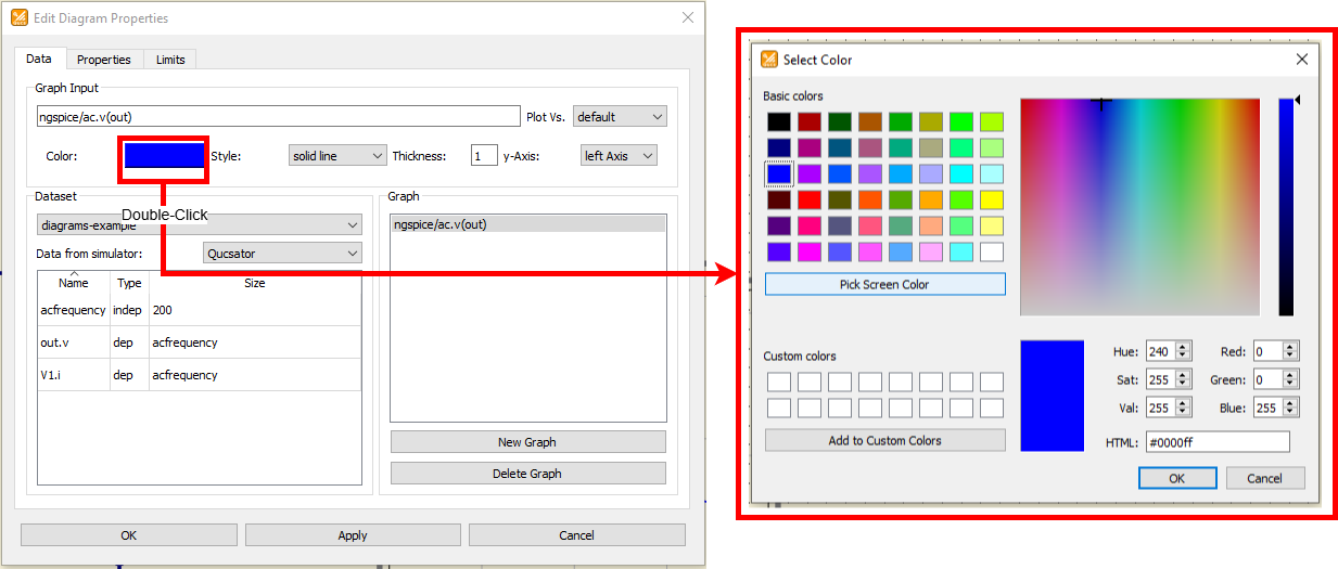
Editing color of a trace on a Cartesian Diagram.
Setting Graph Limits
The limits/window of a graph can be set on the Limits tab of the Properties dialog. In most cases, Qucs-S will attempt to automatically select appropriate graph limits, unless you open the Properties dialog and override it. The exact settings present in this tab will vary depending on the type of Diagram you are interacting with. The figure below shows the settings for a simple 2D Cartesian Diagram.
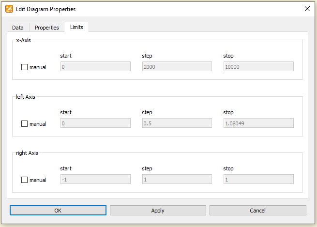
The Limits section of the Properties dialog for a Cartesian Diagram. Here, you can manually select the limits of the graph.
Configuring Axis Labels and Scales
The scaling for each axis, and the label applied to it, can be edited in the Properties tab of the Properties dialog. The figure below shows the settings for a 2D Cartesian Diagram, but of course the available settings will vary depending on which Diagram type you are using.
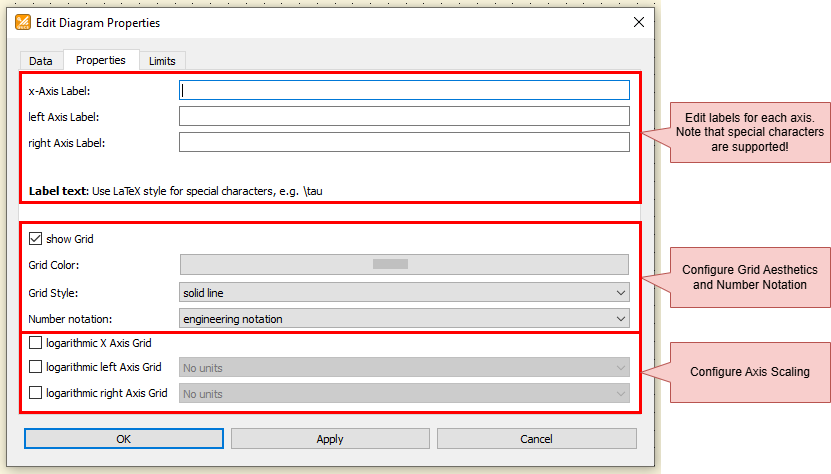
The Properties section of the Properties dialog for a Cartesian Diagram. Here, you can add custom labels to each axis, and configure the scaling of each axis.
Exporting Diagrams
There are two ways you can export a Diagram:
You can export a single trace to a CSV file.
You can export the entire graph to a PNG or SVG image file.
Image Export
Right-click anywhere on the graph’s background (NOT on a trace line itself), and choose “Export to Image”.
Tip
To change the image export type from SVG to PNG, you must manually edit the file name in the “Save to file” box.

Exporting an entire graph to an image file.
CSV Export
Right click on a trace itself (NOT on the graph’s background) and choose “Export to CSV”. Note that this will NOT export the entire graph, but only the selected trace.
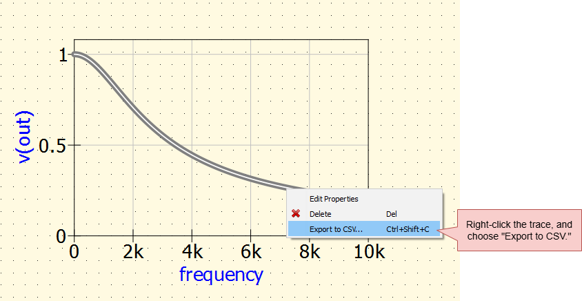
Exporting one trace from your graph to a CSV file.